Anatomy of a Design
I thought you might find it interesting to see the process we went through to create a design for one of our productions. For The Monster in the Hall we knew we wanted something cool that would appeal to teenagers, without being patronising.
The first part of our process was to talk to the writer David Greig, and Director Guy Hollands to extract the keys images, settings, themes and desired tone that would accurately reflect the play.
A rather extensive list of ideas emerged. When commissioning design work, we must minimise the number of iterations, as our budgets (and time scales) can't cope with extended re-working.
So as marketers, it's our job to hone these ideas into an achievable brief and find a suitable designer who could make it come to life.
Some of the ideas generated by Guy and David, although good, were just too complicated to portray in one design, so we had to be selective with the most important elements.
Subtlety of emotion is awkward to convey (without many iterations) so we had to stick to simplified ideas.
One of our early options involved "Duck" and potentially her Dad sitting on a sofa, with a suggestion of a motorbike made through posters. Although we were aware of two other show posters around that time which had predominantly featured a sofa and therefore decided to avoid this.
There was also a lot of discussion about the inclusion of motorbike posters. We were concerned this might look too 80s and therefore not appeal to modern teenagers.
For some time we've been fans of Duncan MacDonald's illustrative style. It has a youthful, edginess that we thought would suit this show. So we approached Duncan at Make Studio.
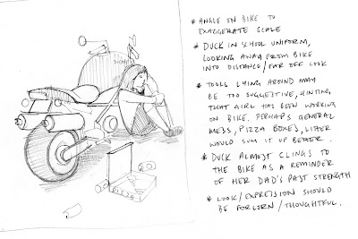
Duncan and I met with Guy, to discuss what options might work. Duncan then sent us some initial sketches so we could agree the composition before he worked it up further. His sketches include useful annotations relating the brief to the design elements.


Click images to view detail
Through looking at these sketches we decided to elimate the extraneous props (pizza boxes and bike tools), as we felt they were distracting.
We wanted people to think that the school girl in the picture "Duck", was comfortable with the bike; but didn't want them to think it was hers. It is a Ducati Monster (yes...The "Monster" in the Hall) and is owned by her Dad.
We felt that a seated pose made "Duck" disappear too much, so asked to see a version with her leaning on it.

This version of "Duck" and the bike, was really starting to take shape. In particular the inking of the bike was in exactly the style we wanted. We were however concerned that she looked slightly too old for "Duck"; and that her leg up pose, may be a bit too sexy. Although this sounds a bit over-cautious, we have to ensure our image works for both public and schools touring, so tiny details like this were considered.
We had an idea of the pose we wanted. So to save time describing this over the phone, or by email, we sent Duncan a snap of me in the position we envisaged.

This kind of source material can save the designer a lot of time and effort going down the wrong route (...and that's how my sneakers ended up in the poster!).

With the final composition agreed, Duncan added colour and made small adjustments to the eyes and feet.

The colour was tweaked...

...and tweaked again, before a background colour and shadow were added - to provide context.

The final design - which we love - was complete. It was used on our website and in the season brochure. It was also used in our leaflets and posters around the town, as well as in show programmes.


Thanks to Duncan for great work on this, and for his patience dealing with our feedback and tweaks.
The Monster in the Hall has completed its schools and community tour; and opens at the Citizens Theatre tonight, playing here until 13 November.
Hx
The first part of our process was to talk to the writer David Greig, and Director Guy Hollands to extract the keys images, settings, themes and desired tone that would accurately reflect the play.
A rather extensive list of ideas emerged. When commissioning design work, we must minimise the number of iterations, as our budgets (and time scales) can't cope with extended re-working.
So as marketers, it's our job to hone these ideas into an achievable brief and find a suitable designer who could make it come to life.
Some of the ideas generated by Guy and David, although good, were just too complicated to portray in one design, so we had to be selective with the most important elements.
Subtlety of emotion is awkward to convey (without many iterations) so we had to stick to simplified ideas.
One of our early options involved "Duck" and potentially her Dad sitting on a sofa, with a suggestion of a motorbike made through posters. Although we were aware of two other show posters around that time which had predominantly featured a sofa and therefore decided to avoid this.
There was also a lot of discussion about the inclusion of motorbike posters. We were concerned this might look too 80s and therefore not appeal to modern teenagers.
For some time we've been fans of Duncan MacDonald's illustrative style. It has a youthful, edginess that we thought would suit this show. So we approached Duncan at Make Studio.
Duncan and I met with Guy, to discuss what options might work. Duncan then sent us some initial sketches so we could agree the composition before he worked it up further. His sketches include useful annotations relating the brief to the design elements.


Click images to view detail
Through looking at these sketches we decided to elimate the extraneous props (pizza boxes and bike tools), as we felt they were distracting.
We wanted people to think that the school girl in the picture "Duck", was comfortable with the bike; but didn't want them to think it was hers. It is a Ducati Monster (yes...The "Monster" in the Hall) and is owned by her Dad.
We felt that a seated pose made "Duck" disappear too much, so asked to see a version with her leaning on it.

This version of "Duck" and the bike, was really starting to take shape. In particular the inking of the bike was in exactly the style we wanted. We were however concerned that she looked slightly too old for "Duck"; and that her leg up pose, may be a bit too sexy. Although this sounds a bit over-cautious, we have to ensure our image works for both public and schools touring, so tiny details like this were considered.
We had an idea of the pose we wanted. So to save time describing this over the phone, or by email, we sent Duncan a snap of me in the position we envisaged.

This kind of source material can save the designer a lot of time and effort going down the wrong route (...and that's how my sneakers ended up in the poster!).

With the final composition agreed, Duncan added colour and made small adjustments to the eyes and feet.

The colour was tweaked...

...and tweaked again, before a background colour and shadow were added - to provide context.

The final design - which we love - was complete. It was used on our website and in the season brochure. It was also used in our leaflets and posters around the town, as well as in show programmes.


Thanks to Duncan for great work on this, and for his patience dealing with our feedback and tweaks.
The Monster in the Hall has completed its schools and community tour; and opens at the Citizens Theatre tonight, playing here until 13 November.
Hx

Comments