Q & A with Tom Piper
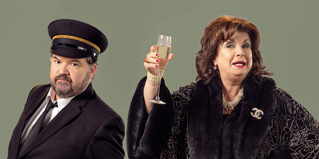
Mrs Puntila and Her Man Matti is an adaptation of Brecht's epic comedy by Denise Mina. Full of piercing political insight, this feisty and fast-paced new version satirises the injustices and absurdities of capitalism.
Here, designer Tom Piper tells us more about the role of design in telling this story.
Here, designer Tom Piper tells us more about the role of design in telling this story.
1) How did you approach designing Mrs Puntila and Her Man Matti, what were your key inspirations for the show?
At its heart the play is a social satire on class, with Puntila a Jekyll and Hyde character who is seemingly full of bonhomie when drunk and a ruthless businesswoman when sober. I looked at the contemporary world of the oligarchs and super rich, the obsession with image, brands and consumption. The way that states and increasingly individuals build walls to keep the undesirables out, but in the process trap themselves within their gated enclaves.
2) What is it like working with an adapted classic – what have you taken from the original Brecht and what’s come from Denise Mina’s new text?
I didn’t know the play, so I came to it with open eyes. I have used references from Brecht’s time; the depression of the Thirties, the theatre style of the Russian constructivists, Fritz Lang’s Metropolis as images of a dystopian future where the rich and poor are completely separated, and the workers forced to work as human machines without purpose.
Denise’s version has brought a very distinctive Scottish voice to the play and made the plight of the contemporary zero hours workers struggling to find secure employment very vivid. She's also written with Elaine in mind, so the comedy feels very relevant. Part of my role has been to help bring these two very different worlds into conversation with each other while allowing the bigger themes to still come through.
 |
| Denise Mina in rehearsals. Photo by Aly Wight |
3) You’ve worked with the director Murat Daltaban and DOT Theatre before on Rhinoceros – what is the creative process like?
It is fascinating working with Murat, he brings a global perspective to the piece and sees it in a very allegorical way. I really enjoyed the liberation on Rhinoceros to not get trapped in a naturalistic interpretation and this feels similar. He sees the play as a parable, full of powerful archetypes and has used a lot of international events as a reference point. For example, the struggle for democracy in Turkey and Hong Kong.
 |
| Murat Daltaban and Oguz Kaplangi in rehearsals Photo by Aly Wight |
4) There are so many themes and tones in the play – comedy, politics, history and the contemporary – how do you balance these in your design work?
With difficulty! I suppose I'm interested in the surface veneer of wealth; how much we are obsessed with brands and status. I have created a basic structure on which to tell the story. A scaffold framework which is then clad (as building sites often are) with glossy images of unattainable perfection. We use some key real elements to suggest location, such as a grand baronial staircase, but juxtapose these with a rough and improvised form of visual storytelling. The actors will remain visible changing at the sides, reminding us that this is an artificial creation and that we are always storytelling. In costume I am heightening the characters in a deliberately grotesque way to help emphasise the gulf between the rich and poor worlds, but it is difficult to design comedy! I hope the design invites the audience to use their imagination to create location and enjoy the sometimes-bizarre juxtapositions.
 |
| Tom piper design sketch |
5) What’s your favourite part of the process of putting a show together?
I always enjoy the early creative discussions full of endless possibilities but in the end, it is seeing how the story comes across with an audience. Working out what has worked, how to change and adapt things.
 |
| Tom Piper design sketch |
6) You work across multiple artforms - do you have a favourite? Does the work you do in each inspire the others?
I think my main love will always be theatre. There is something about the live performance element and the shared story telling with a group of people in one room which feels so human. When I started out last century, I think people believed that technology would kill theatre. That we would all be wondering around with VR goggles on but if anything, people are more attracted to the idea of coming together in real time to share and be part of an event. Much of my non-theatre work has come through other organisations such as, museums that want to create immersive ‘theatrical’ spaces. I bring my interest in narrative, metaphor and audience involvement to these projects. For example, on the ‘Poppies Project’ at the Tower of London I created the sculptural elements that flowed around the tower, adding a metaphor of the poppies coalescing to form a blood red sea. The volunteer planters became the actors, creating the piece to the applause of onlookers above the moat. It became an unintended piece of theatre in its creation, not just in its final realised state which like theatre, only lasted for a moment before it was cleared away.
7) What do you love most about your job?
The people I collaborate with and without whom I would be nothing.


Comments